
Showing posts with label Daniel collin. Show all posts
Showing posts with label Daniel collin. Show all posts
Tuesday, 13 September 2011
digipak analysis
Text - A large size Bootle font, to display the name of "The Beatles" This font is recognized world wide because this is the font the band uses one all their products, Also this is a way the band is recognized. The colour of the bands name "The Beatles" is near enough the only colour on this advertisement, because it is trying to attract people to the advert, it also makes the advert pop.
The relationship between the image of "The Beatles" and the text goes well, because when the font Bootle is used you expect it to be related to "The Beatles" Also the information is in a smaller font and also looks like Times New Roman, and it is near enough the same colour as the background of the advert just a bit darker, which is good because it helps the other information stand out. Also the remastered and the rediscovered goes well with the the pictures of the albums, and also the in stores now relates as well because it shows a promotes where you can get it.
The iconography of this image shows a general representation of the band, at this period in time, even though this wasn't produced when they were still " The Beatles"
The only signifier's in this video are the Apple in the right hand corner and the font which displays the bands name.
We know that "The Beatles" are mainstream because of the infamy they have/ had, but from the advertisement we can tell that "The Beatles" are aimed at a mainstream audience because of the logo for EMI a well known production company which produces vast's amount of music in loads of different genre's.
digipak analysis
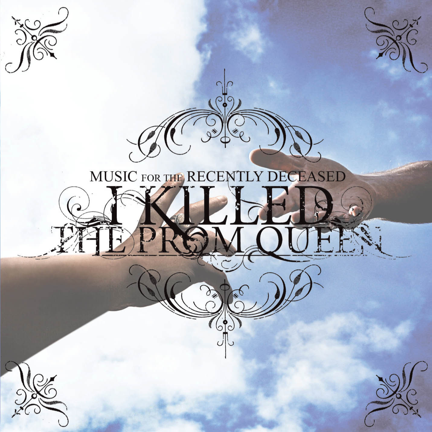
Images Used - Two Hands, Clear Sky with Clouds, Tribal patterns.
Text Used - Looks like Hawaii Killer for the bands name " I Killed The Prom Queen" it is positioned in the center of the image, this is to display the bands name, it also is overlapped over the two hands grasping at each other the font size looks to be a medium font size of about 24. The font for some information looks to be in the font Times New Roman, "music is for the recently deceased" it also looks like it is in a smallish font about size 12 - 18.
The relationship between the text and images on this digi pack fit together quite well and it suits the bands name, one hand could represent one reaching down from the afterlife and the other could represent one from the living world. This is why the name of the band "I Killed The Prom Queen" goes along with the image, because one hand could be the person who killed the prom queen and the other could be the dead prom queen.
The iconography of the digi packs font fits in extremely well with the bands genre, because the font is quite dark, Gothic. Whereas the music produced by this band is heavy.
This album cover seems to be underground because of the type of music the band produces, his could also be there first album cover, however i doubt that it is there first album cover because of how it is put together.
This digi pack is seem to focus on the target audience of people who would like rock, and the way it is established as rock or is somewhat located in the rock genre is displayed by the Gothic font.
Subscribe to:
Posts (Atom)